
What Makes Food Packaging Design Effective?
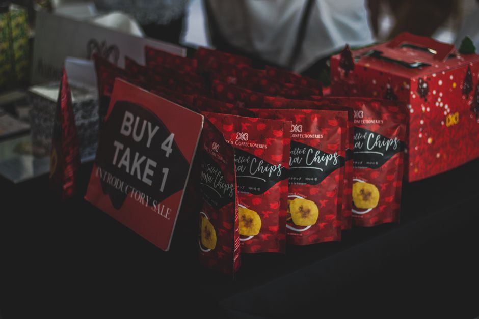
Effective food packaging design makes the product easy to spot, identify, and use, both on a store shelf and in a small online image. It gives the food name and essential information a clear place, distinguishes the brand without hiding the product, and works in its real package format. The strongest design is tested for visibility, readability, preference, and usability before a print run.
What makes food packaging design stand out on a crowded store shelf?
Food packaging stands out when a shopper can recognize the product quickly and distinguish it from nearby choices. Contrast, shape, imagery, and typography help create that first read; the product name and key information then confirm what the package contains.
The U.S. Food and Drug Administration’s Food Labeling Guide calls the principal display panel the part of a package most likely to be seen at purchase. The FDA says the food’s statement of identity and net quantity statement belong on that panel. Treat it as both a design focal point and a labeling space, not as leftover room for decoration.
“The PDP is that portion of the package label that is most likely to be seen by the consumer at the time of purchase.”
— U.S. Food and Drug Administration, Food Labeling Guide
Distinctive does not mean crowded. A package can use a memorable color or illustration and still fail if the name is hard to find. The SAGE Open study on snack-food packaging identified color, shape, image, line, and typography as five essential design characteristics in its model. Its research involved 25 design professionals and 121 students, so use those findings as a useful design lens, not a universal formula for every food category.
Compare the design against actual competitors. Ask what a shopper notices first, what food they think is inside, and whether the brand is easy to tell apart. The consumer-perspective study in Foods surveyed 1,219 customers and grouped packaging factors into seven areas, including information, protection and recognition, usability, geometry, environmental friendliness, endurance, and color. That broader framework is a reminder: appearance is one part of packaging performance.
How do I make my food packaging look professional on a small-business budget?
A small business can make packaging look professional by setting a clear brief before paying for finished artwork or production. Begin with the audience, the product’s position, the competitors’ visual patterns, and the information that must appear on the front.
Write down the core decision in plain language: what the food is, who it is for, and what should make a shopper recognize this brand. Then gather examples from the shelf or category and mark where competitors place their names, flavor cues, and images. The aim is not to copy a rival. It is to see which visual conventions help shoppers understand the category and where a different choice can create distinction.
Use a simple hierarchy. Give the product identity a strong position, make the flavor or variety easy to scan, and keep supporting information subordinate without making it unreadable. Before finalizing any label, check current requirements. The FDA guide says its last revision was in January 2013 and notes that some allergen guidance has since been updated. Its net quantity type-size requirements vary with principal display panel area, from 1/16 inch on panels of 5 square inches or less to 1/2 inch on panels larger than 400 square inches.
Prototype cheaply before committing to production. Print draft artwork at actual package scale, attach it to a sample container, and compare it with competing packages. Ask people unfamiliar with the design what product they see first and what they think the flavor is. Keep the questions consistent, and use the answers to refine hierarchy rather than treating every preference as a design command.
Should my packaging design prioritize retail shelves or online product photos?
Packaging should work in both settings, with the product identity and strongest visual cue surviving each one. A design that reads well in a shopper’s hand can lose its meaning when reduced to an online thumbnail, so test both views before selecting a final direction.
The International Journal of Design’s 2026 study, “From Shelf to Screen”, reports that online grocery images are typically about 3 cm on desktop displays and 2–2.5 cm on mobile screens. In an eye-tracking test with 61 participants, designs based on the study’s guidelines received an average of 111 milliseconds more viewing time, a 22% increase, than designs that did not follow them. These findings apply to the tested designs and sample; they support thumbnail testing, not a promise of the same result for every brand.
Make two checks part of the design review. First, view a physical mockup from shelf distance and see whether the brand and product are clear. Then shrink the same artwork to the size shoppers see online. If the illustration becomes a blur or the product name disappears, simplify the image or strengthen the hierarchy rather than adding more small copy.
Attention is not the same as preference. In a 2024 orange-juice packaging study in the International Journal of Food Science & Technology, nutritional information drew the most visual attention during evaluation, yet the package that attracted the most attention was not necessarily the one participants liked most. Test what people notice and what they prefer as separate questions.
| Design check | Retail shelf | Online product image |
|---|---|---|
| Product identity | Readable on the package among nearby choices | Recognizable after the image is reduced |
| Visual distinction | Brand cues separate the pack from competitors | One or two strong cues remain clear at thumbnail size |
| Information | Front-panel hierarchy supports quick scanning | Essential visual cues do not depend on tiny text |
| Testing goal | Check recognition and shelf visibility | Check thumbnail clarity and preference separately from attention |
How can I make the product and flavor clear at a glance without cluttering the package?
Make the food name and flavor the first clear message, then arrange supporting details in a smaller but still legible order. Clarity comes from choosing what leads, not from squeezing every possible message onto the front.
Use one strong cue for the product and one for the variety. That cue can be wording, imagery, or color, provided it helps identify the food without competing with the brand. The SAGE Open study points to image as the most significant impact factor among the characteristics it examined, while also noting typography’s role in helping consumers understand brand and food information. A vivid image cannot do the whole job if the words are hard to read.
Contrast matters. A study in the Journal of Applied Packaging Research, involving 13 visually impaired participants, found that contrast between text and background had the greatest effect on readability among the typography and color factors assessed. In its test samples, 90% of respondents successfully read text with higher contrast. Increasing letter size to 14 pt improved nutrition-information legibility in the study regardless of font type. These are study findings, not a substitute for checking applicable labeling rules or testing the actual package.
Usability also belongs in the brief. The same study reported difficulty opening and closing packages, and proposed simpler opening mechanisms and materials that are less slippery or breakable as accessibility improvements. Test the package in hand: can a person grip it, open it, close it, and store it without the graphics or structure getting in the way? A beautiful pack that frustrates use is unfinished design.
Frequently Asked Questions
How do I choose packaging colors and fonts that distinguish my brand from competitors?
Compare your proposed colors, shapes, imagery, and typography with competing products, then check whether the product name stays easy to read. Research identifies color, shape, image, line, and typography as important design characteristics, while a study of readability found that text-background contrast strongly affected legibility.
What should I test on a food packaging mockup before sending it to print?
Check whether shoppers can identify the food and flavor quickly, read key text, and distinguish the design at shelf distance and in a small online image. Test preference separately from attention, and assess whether the package is easy to open, close, hold, and store.
How can packaging be attractive while still being easy to open, store, and use?
Treat the package structure and opening method as part of the design, not as details to settle after the graphics. Test a physical mockup with users for grip, opening, closing, and storage, then refine the material and format while preserving clear product information.
Sources
- U.S. Food and Drug Administration, Guidance for Industry: Food Labeling Guide
- Foods, Investigating Food Packaging Elements from a Consumer’s Perspective
- Journal of Applied Packaging Research, Food Product Packaging Adapted for Visually Impaired and Elderly People
- International Journal of Food Science & Technology, Exploring the Effects of Packaging on Consumer Experience and Purchase Behaviour
- SAGE Open, Impact of Snack Food Packaging Design Characteristics on Consumer Purchase Decisions
- International Journal of Design, From Shelf to Screen—Five Guidelines for Getting Consumers’ Attention When Selling FMCG Online
Keep reading

How Do I Build a Routine When Depression Makes Everyday Tasks Feel Hard?
A practical behavioral-activation guide for building a smaller routine when depression makes daily tasks and avoidance feel overwhelming.
What Foods Can Improve Memory and Concentration?
An evidence-based guide to food patterns that support brain health, with practical meal ideas and realistic limits.

Why Do I Need an Anticoagulant for AFib?
Understand why AFib anticoagulants are prescribed, how bleeding risk is reviewed, and which safety concerns to raise with a clinician.
How Do I Understand Fatty Liver Test Results and Fibrosis Risk?
A plain-language guide to fatty liver ultrasound findings, ALT and AST, FIB-4 scores, FibroScan, and specialist follow-up.